For the average person, data without a narrative is like a trip into the wilderness without a compass: overwhelming and disorienting. But when the facts are tied together by a good story, an otherwise intimidating journey turns into an enriching experience.
That’s why data journalism — a kind of factual storytelling based on data — has become a big trend. This discipline (which burgeoned in 2014 and is sometimes called explanatory journalism) goes beyond topline news developments to clearly explain complex subjects.
Take a look at this solid piece of data journalism posted on NYTimes.com, which invites readers to explore what may be surprising patterns relating to racial disparities in income mobility. It draws from an extensive study that looked at anonymous earnings and demographic data for virtually all Americans now in their late 30s. The narrative in this piece weaves various annotated and interactive data visualizations into text that presents a human interest angle, quotes from experts, and analysis of specific statistics.
When journalists weave data visualizations into a strong narrative, the resulting union is a memorable story that appeals to both our logical brain functions and our primal need for storytelling, helping unseed even our deepest-held assumptions about why things happen.
This makes data journalism a powerful tool for not just the media — but HR leaders too.
Why HR needs data journalism
Like good journalists, HR leaders often need to investigate and shed light on previously unquestioned ideas. Whether it’s the role of non-monetary rewards in driving performance or the link between employee turnover and customer retention, collective mental models about how people actually drive business performance can be inaccurate, leading to gradual but potentially damaging effects in the long-term.
And like journalists crafting stories out of large public datasets, there is no shortage of data for HR to work with: many organizations have moved to digitize the entire employee lifecycle, from on-boarding to off-boarding. That’s a lot of data.
However, to really drive organization-wide change, the most successful HR teams don’t just have a lot of good numbers — they make the data actionable. This requires a two-pronged approach, one that connects the workforce to business results and ensures the right people actually use the insights to improve decisions.
A key part of this involves helping busy managers and C-suite leaders quickly understand the meaning and value of the insights being provided. With the right data visualizations, key insights revealing cause-and-effect relationships can be woven into narratives that are accessible to non-technical audiences.
For example, the HR Business Partners (HRBPs) from Alere use standard slide presentations featuring data visualizations to provide an organization overview that includes headcount, retention, and first year retention. Each business partner can use this to review their areas.
Yes, even turnover rates and headcount numbers can be turned into memorable stories, and people experts are in a good position to tell them.
8 tips for telling a good data story
The first step involves asking the right questions and doing the right analysis. Next, it’s time to package it all up in a compelling data story. At this point, several decisions must be made: What information do we lead with? What type of visualization is best? Follow these tips to master the art of people data journalism:
1. Craft your lead
In journalistic terms, the lead is the opening of a story. It is “the puzzle piece on which the rest of the story depends,” states NPR’s storytelling training materials. What is its main job? To hook the reader.
For HR pros telling stories with data, the lead is equally important. It tells the CEO, management team or other data consumers why they should make your story a priority over the other 100 things on their to-do list. With this in mind, consider tactics like leading with an intriguing question to draw the audience in.
2. Find the right story structure
It is important to determine which story structure (and data) suits the situation at hand. Presenting the story in chronological order, for example, may not make sense if you are presenting to a busy executive who only has a few minutes of his time to give. In this case, a better structure starts with the most important information first. At the same time, it’s important to share enough context — previously established goals, historical data, KPIs, or industry benchmarks — so the audience understands why the data is important.
3. Choose the right visualizations
Scatter plots, bubble charts, heat maps, and line charts — there are so many different types of visualizations available that are easy to create, thanks to the proliferation of data viz tools. But it’s important to select the right chart for the right situation, or the viewer may misinterpret the information.
The first step when selecting a visualization is to ask: What is the insight I want to pull from the data? Is it a relationship? A breakdown? Distribution? Trend? Seasonality? Answering these questions will help you select a type of visualization that helps the viewer gain an accurate understanding.
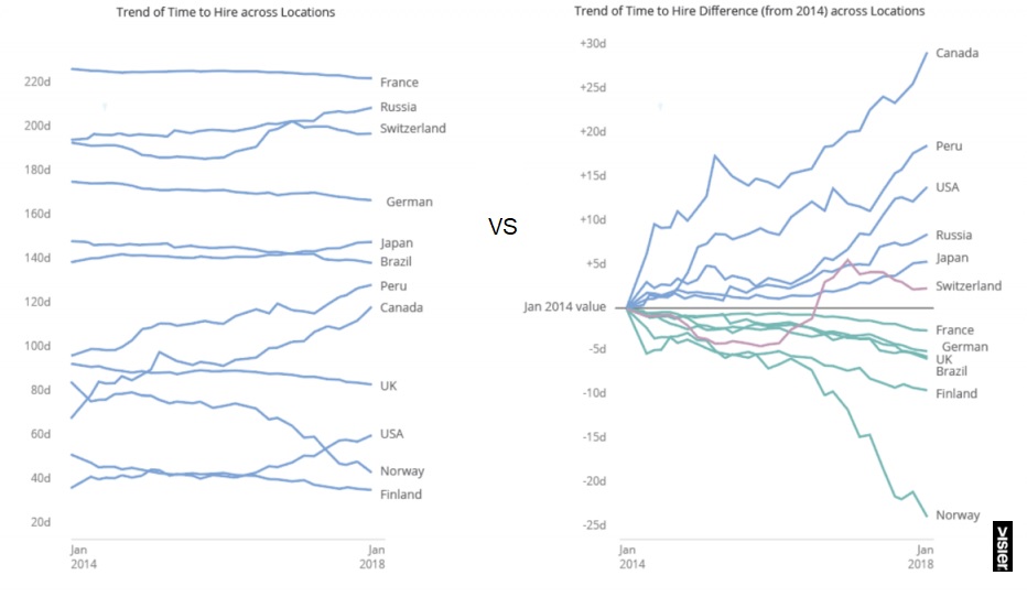
Sometimes, it’s not about using fancy 3D visualizations, but simply about thoughtful treatments on some of the core visualization types, such as the trend chart in this example:

If the key message we are trying to highlight is how countries have changed in time-to-hire since January 2014, instead of just showing a regular line chart, the y-axis can be “normalized” to show change, which makes the pattern a lot more obvious.
Smart use of color to show countries that have consistently trended up instead of down further reinforces the message: The one country that is behaving differently (Switzerland) stands out, and the audience can instantly see that it is the only country that dipped down but then recovered relative to the January 2014 time point.
4. Use motion
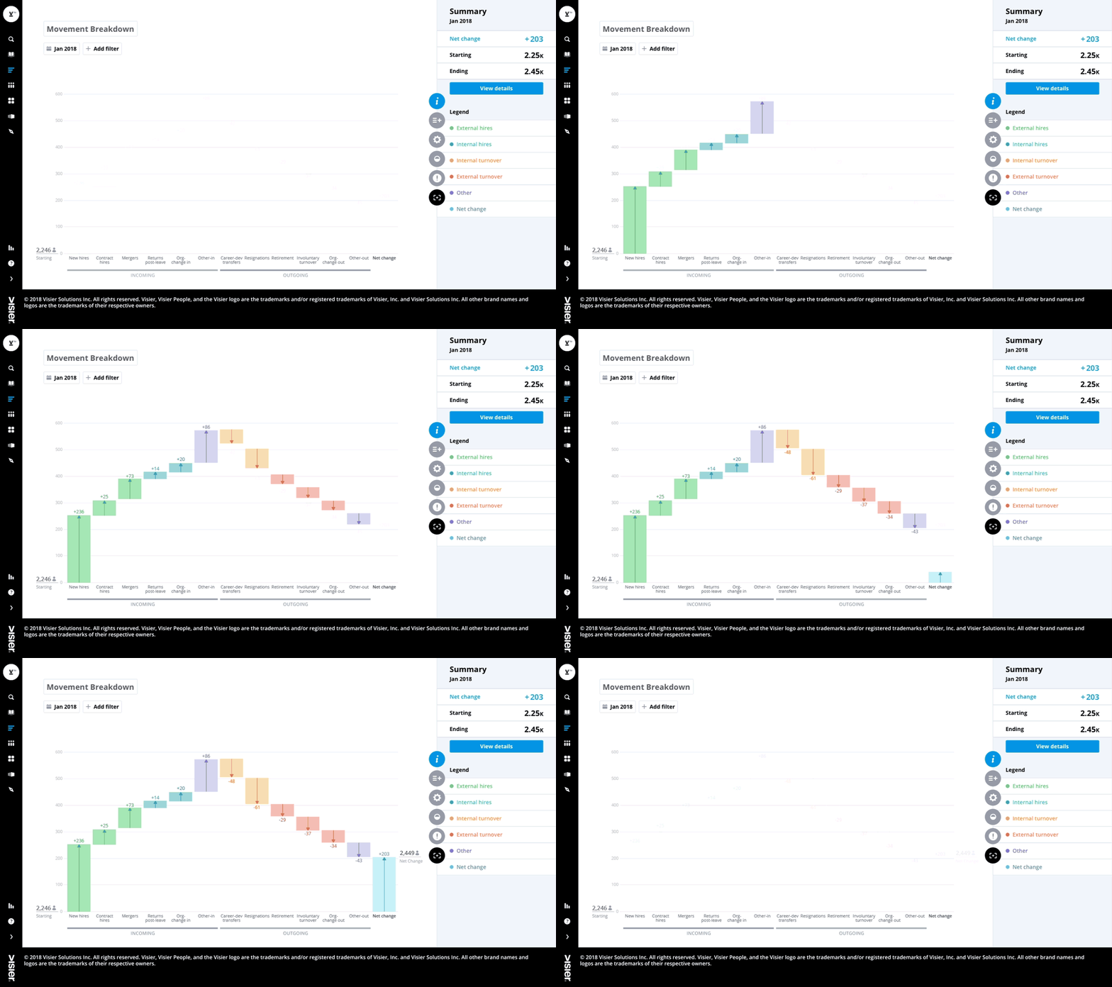
Motion can help guide the viewer through complexity. For example, in the waterfall visual below, instead of showing all the data at once — and risking overwhelming the reader — a simple motion unveils the story step-by-step, showing increase, then decrease, and finally net change.

5. Make it interactive
Human thought process goes through a discovery journey — the answer to one question often leads to more questions. When the full dataset behind the story is made available for further investigation, the audience can dig deeper into the data and draw their own conclusions.
An interactive visualization allows the audience to do this. They can drill down into key areas and play with the data, perhaps even finding other insight that wasn’t explicitly called out in the narrative. Exploring data visually is a lot more intuitive and approachable for the audience than the traditional approach of simply linking to the source data behind the visual.
Furthermore, an interactive visual allows even the author or presentor to answer questions from the audience on-the-fly during a meeting, helping to further engage and persuade key decision makers.
6. Encode the narrative in the visuals
Like subtle subplots that reveal key nuances about characters and their motivations, visuals can act as a story within a story. To be effective, the narrative thread needs to continue within the chart — the story doesn’t end with the text. It can be as simple as annotating the data is important to highlight a key insight.
7. Use red to show something urgent
People pay attention to bad news, and business leaders are no exception. When the situation calls for it, highlight the most alarming statistics. By using traffic light indicators (green = no issue, yellow = watch, and red = action required), you can help executives focus quickly on the metrics that indicate a problem.
8. Keep it simple
Sometimes the most effective visualization is a simple bar chart; don’t use complex visualizations unless they help reveal useful patterns. For example, a simple visual trend line reveals the historical direction, the current direction, and how the metric will shift up or down in the future. This can be very effective in communicating to a future-focused executive how a trend will impact the organization in the coming months or years.
